Lesson 6: Fooling the Eye

Fooling the Eye

There are tons of things that can be done to trick players into believing something is undenyably real, when in reality, a designer is out to cut the cost of the overall rendering budget by creating cheap knockoffs of the real thing. The real trick with everything in this lesson, is proper distancing. This lesson probably won’t cover every single trick known in the gaming world, but they are tricks that i’m aware of and I use whenever possible. You can use these tricks on any map you work on, though implementation or functionality may depend on the engine you are using.

Alphas

Alphas are powerful textures that allow you to create a lot of illusion. Alphas are nothing more than a 2-Dimensional (flat) representation of something 3-Dimensional. Alphas can range from simple to very complex things. Some examples of Alphas would be: Barbed wire, grating, wiring and conduits...a lot of times very small things that level editors would not be able to create, will be made from an alpha texture. Because Alphas are flat, a designer needs to use them carefully or the fact they are fake will be an eyesore. Alphas generally look best “at a distance”, so try to use them there if possible. It’s important to encase the alpha in something 3D, because the last thing you want to see is an alpha from a naked side, it will completely disappear--it would be like looking at a sheet of paper from the side (but even paper has “some” thickness, alpha’s DO NOT).


Fog

Fog is a very touchy tool, and how it works can vary from engine to engine. Fog, in the general sense, is generally thought of to create a mood for your level. Some engines have the capability to drop things from rendering entirely once the fog becomes completely opaque. For those of you who are less fortunate, and aren’t using a “clipping plane” with thier fog, here’s a tip or two about using fog to your advantage. The nice thing about fog is having options to cheapen a lot of things, mostly backdrops. For example, in the map 78’ Station in Gore (PC 2002), much of the surrounding level is built very crudely with basic shapes that represent structures. A long fence encompasses the players, keeping them from ever getting close to seeing that the buildings (with smokestacks) are actually flat, or the highway running along one side is made from a handful of cube shaped brushes. Fog can give the appearance that so much is going on, when the whole time, you are making an economical cut to the level and putting the saved budget into what the player can actually interact with.


Texture Tricks

Trick 1: Shadowing Textures: This is a fun one, granted you can find a texture artist who can pull off proper lighting techniques. The trick is to make a texture, like small decorative arches that repeat over and over (something that would normally be VERY expensive to build in 3D), and to paint on fake shadows. The next step is to use them a plentiful distance from an up close view. It is really hard to discern real geometery and fake geometery if you can't get up close and have a look. This is one of the first things I learned back in 1997, and I still see it used today.

Trick 2a: Texture Scaling: I still use this one a ton, but it’s a little harder to explain, and probably only works with slightly older BSP engines, but it’s a nice thought. This trick can be really cool and works in two different ways. The first is scaling down: Imagine a 256X256 ground texture, riddled with dirt and grass. Typically, i’d use this at normal scale for the ground where the player will be; however, if I’m going to build some far off terrain, like big hills or mountainous cliffs way off in the distance, i will scale the texture down to 1/16 (or more) it’s normal-size..it’s like zooming way-in on the texture. It makes the texture extremely blurry when it’s blown up that big, but when it’s way off in the distance, it actaully looks better than at normal-scale, where that texture would repeat numerous times, giving that geoemetrey a zebra-striped look. Since you aren’t after detail with things that far off, you are only winning, and depending on the engine, doing this saves shademaps. If my hill is 400 triangles, it should be 400 shademaps with the texture set normal. With the texture set to 1/16 the size, i cut the shademaps down to 25, which will only improve the level performance. You can even use this trick on building textures too, such as bricks and concrete, even windows! The further off it is, the more you can scale down!

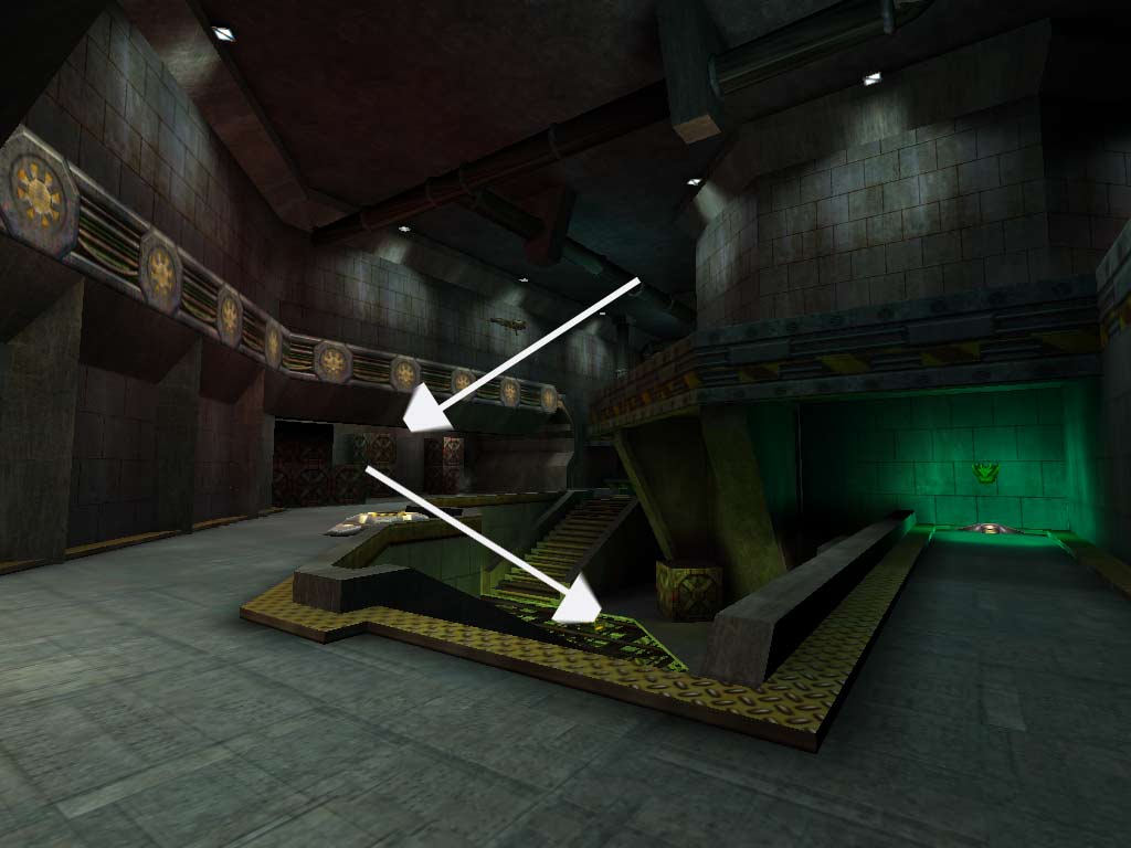
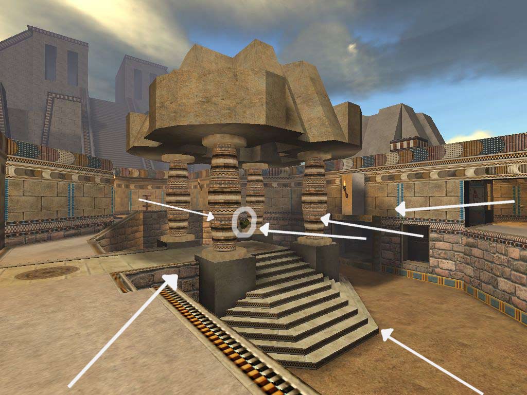
Trick2b. Texture Scaling Part 2: Now that i’ve told you how you can stretch a texture out to fool the eye, lets talk about scaling a texture up, or making it repeat more often. I use this trick FAR less than the other scaling trick. Simply because, it is more expensive to do, and isn’t very worthwhile for things that you can’t get up close to. However, it has it’s benefits, such as the screenshot below. In this picture, to create the illusion that there are a billion steps on the zuggeraut, i took a normal-sized trim texture and scaled it to 4X it’s normal-size (meaning instead of 1 section of trim taking up 16x32, there are now 4 sections of trim taking up the same 16X32 space). The geometery iteslf is flat, a ramp, but that trim is repeating so often give it the illusion that every step is actually there. Just remember, the more you scale up, the more expensive the shademaps become. (also note, the bricks and trim of that building below are scaled down to increase the texture size as mentioned in Trick 2a)


Trick 3: Picture of a Scene: Something worthy of noting in regards to skyboxes. This is actually one I saw used effectively during the creation of Patriots: A Nation Under Fire (PC 2007). Let’s say you want a backdrop of an area that you’ve built in another area, even another level perhaps. Instead of copying and pasting the geometery into that area, take a screenshot of it and make a texture out of it. The backdrop needs to be reasonably far away, and the player cannot be allowed much opprotunity to get an angled look at it, but the first time I saw this trick done, it took me a good minute and someone pointing it out to see it--and it is a HELL of a lot cheaper than using a 3D background. You are basically making an alpha texture out of a picture of something already built in your level! Kudos!

Lesson 5: Aesthetics Part 2

In this lesson, I will explain some more of the things that designers will do (or will not do) to please the eye of the player. Some of this will seem so simple, and just downright common sense, but as every designer will find out, every detail counts.

THE LIGHTING
(MP AND SP)

Nice lighting can be a designers secret weapon, and if used correctly, can make an area look so incredible without doing very much work at all. In your planning, it would be good to include some ideas of how you want to light every area. Whatever you do, don’t assume that all lighting comes from above. Depending on your map, lighting can come from every angle in numerous styles. You will be amazed at how a blue light, in a spotlight or coned shape, coming up from the floor, will look. Or, the classic look is some fancy grating system on the ceiling that creates grid-like mosaics on the wall. The lighting you create can replace a ton work because it adds an unique touch to your areas that nothing physically built can mimic. Also, lighting is generally easier on the computer (depending on your engine) than a boatload of geometry. It’s best to get the strongest lights in place before adding what is called ambience. Ambient light is like a gentle flood light that ensures everything is getting some light, but you do not want to overdo these lights, it kills the mood...do them last. Also, i recommend getting nearly ALL the lighting the way you like it before moving onto the next area, it’s a time saver. This saves you from coming back and fighting conflicting lighting sorces later on.

THE PICKUP PLACE
(PRIMARILY MP)

One thing that is often respected by game players all over, is signaling where the pick up items are. This is more up to your own personal design choice, but having something indicating where pickups are makes learning the map a little easier. An example of a pickup place is shown below, the item in the green light is body armor, floating above a pad. You can even go as far as to put armor in green lighting and weapons in red. Players who see this catch onto maps a lot faster, plus these little nuances can add a nice little touch to your area that may be lacking a little spice.


THE TOTAL PACKAGE
(MP AND SP)
Now that you’ve got some idea on what adds flavor to an area, it’s important to bring the whole thing together. This means paying attention to everything in your map. If you have a wild ceiling, doors, walls, lighting, but don’t do any detail work to the ground, you are cutting youself and your players short of a perfectly rounded map. Sometimes designers (and i’ve been guilty) get too carried away with detailing out a section of a room, and then run out of (rendering) budget to finish a wall or floor. Know your limitations before going wild with the design. Every view of your map should be filled with a lot of things going on, like no matter what you are looking at, it’s worth taking a picture of. For example, in the picture below, I will show you how i detailed this room to capture this elaborate scene that took me only about a day to build:

Floor:
2 Different dirt stains
Rubble
Painted sections dividing the floor
Fire
Hummer
Pipes

Walls:
Pipes
Stains
Garage doors
Tons of trim
Normal and broken rafters/beams
Some lighting effects
Steam

Ceiling:
Hole in roof/sky showing (great for lighting btw)
Ventilation shaft
Hanging lights
Pipes
Rafters/Beams
Trim

Lesson 4: Aesthetics Part 1

(Both SP and MP)

In this lesson, I will explain some of the things that designers will do (or will not do) to please the eye of the player. Some of this will seem so simple, and just downright common sense, but as every designer will find out, every detail counts.

THE TOILET BOWL EFFECT

The toilet bowl effect pertains mostly to outdoor areas, where the retaining walls of the map are at an even height--thus making you feel like you are in a giant cylinder, or toilet bowl if you will. Unless you are in the middle of a giant missile silo, there shouldn’t be any excuse for having the same scaled wall encompassing even a small amount of your area. Break it up! Even a guy from Nebraska, who is used to looking at everything at one height, can envision craggy terrain, small buildings, power lines, pipes, monuments, trees, cranes, highways, the list goes on and on of what you can do to build fake surroundings that close in the map while breaking up the horizon where sky meets the level. In the example below, I have shown you an example of some simple ways to break up the height of a level's surroundings, rather than a wall of equal height encompassing the level, like a toilet bowl.


THE MAN IN THE BOX

This is much like the Toilet Bowl effect, except it relates primarily to interior areas of your map. One of the worst things you can do, is build your map full of box shaped rooms. Box shaped rooms are easy to build, but creates minimal fun and originality. One box shaped room in a map probably won’t harm a level (it’s almost unavoidable sometimes in a modern setting), but if it’s avoidable, drop it from your map. Every room in a level should bob, weave, and twist with Over and Under elements whenever possible. It’s not asking for much, even rooms shaped somewhat like a H are more intriguing.

TRIM TRIM TRIM

I CANNOT EXPRESS ENOUGH THE IMPORTANCE OF TRIM!! Trim is so vital to the appeal of everything you see. Even if you are copying a real-world room without trim, trim the hell out of it. Trim is by far, the single most important thing in a room, next to a door and walls. Trim is a very easy way to make a boorish room come alive. It adds depth and shadows, adds character and perhaps a complimenting color an area is lacking. Heck, you might even trim out your trim in some instances! Sometimes you don't even need to explain what kind of trim it is, just make sure it is there! It doesn't matter if it is thin or think, concrete or track lighting, trim from ceiling to floor. In my opinion, it should be over half of your brush work.

CLOWN VOMIT

Also called, theme, or the lack thereof. A map should have a consistent feel about it. This is accomplished by carefully picking out a texture set that compliment eachother. My suggestion to you is building the room in your level that has the most detail first so you can get it looking the way you like it. The textures (art) you use should be the primary palatte for the rest of the level, giving it some universal look. Nothing makes a map look more gross than a map with three different texture themes throughout the map. For example, don’t make a orange and gray metal laden room link into a green and yellow stone room. A consistent look is key. Not that you can’t change up areas of your map, just be careful to keep some of the same colors that you’ve picked throughout it all.

Lesson 3: Flow Theory Part 2

Okay, in lesson 2 I discussed proper item placement and how it can help your flow. In this portion of Flow Theory, we're going to go over some of the do's and don'ts of laying out levels. All these fundamentals can be applied to both singleplayer and multiplayer. I would follow these guides as best as possible, as this can make or break you level in the fun department.


THE DEAD END
(primarily MP)
Having a dead end in your level can be catastrophic, and should be completely avoided if possible. A dead end is defined as: the sole entry is also the only exit. If a region has 2 entrances and 1 exit, it's not a dead end, but not much better. Sometimes the dead end is unavoidable for many reasons (visibility, unexpected design flaws, etc) but there are some ways to negotiate having a dead end for the good. First thing, is a teleporter. These devices work, but are typically less than smiled upon in the design world unless you are in singleplayer. The second way to make the dead end less deadly, is by making it worth the risk of getting trapped and placing extremely powerful items and power-ups within it. The players going here must be willing to commit possible suicide, but at least they can be rewarded--instead of being frustrated by finding nothing except the chore of running back out of this level bastardization. Even long hallways that take large amounts of time to navigate down can entrap the player in a bad situation, and should never take more than a few seconds to get through. Alcoves are alright if they only take roughly 1 second to get in and 1 second to get out of. Of all things to NOT do in your level...Dead End is king....the murderer of good flow.

NOVELTIES
(MP)
Everyone wants their level to be unique, or the wildest ride imaginable. Some designers get the crazy idea to create novelties in their levels. An example of a novelty would be low gravity, or underwater, perhaps rotating platforms..something that generally stands out in a level. Sometimes, these outstanding concepts can be killer, and should be used very carefully. It's in this designers opinion that if you do go with some novelty, that it should only be 1 per level. I still wouldn't recommend maps with that extra edge, because it is no replacement for a well designed map. Novelties can be an extreme hindrance in gameplay and stressful to the player, so take note. On the other hand, singleplayer games revolve around this kind of setup, and usually the more there is, the merrier the gaming experience. Strange how it works, huh? The difference is the pace. Multiplayer games need to be fast and flowing with little time for decision making, its run and gun. Singleplayer typically puts the players at less high-paced duress, and gives them time to think or make those difficult jumps onto moving platforms.

OVER AND UNDER
(MP AND SP)
This is what separates the boys from the men (or girls from the women). While not having over and under in your map won't kill the map, it certainly will make it boring and novice-like. Over and Under (or region over region) gameplay is when you are forced to look up or down at other regions of the map, rather than always looking straight ahead of yourself like many of the earliest shooters did. Over and under creates dynamic gameplay and unleashes new elements of strategy in your level. The flip side to this concept are the technical issues they can cause. Over and under means you are exposing more areas, which can add more expense and a bigger hit to the performance of the level, which is why planning is crucial--to avoid going overboard on your budget. The idea is to limit what is visible (visibility: which we will discuss soon), while keeping interesting gameplay elements in your map. A simple example of over and under is pictured in this tutorial.


THE WAY OUT
(primarily MP)
Going back to the Dead End segment of this lesson. In similar fashion, one thing to remember is leaving ways out. Every area (or region) needs at LEAST 2 ways leading out of the area, preferably three. This can actually be the hardest thing for novice designers to pull off, once again, because having so many areas opened up for gameplay, it can cause performance problems. With any luck, proper planning and vis (soon to be discussed) should save you here. Having multiple ways out of an area creates unpredictable playing situations. If a player has only 1 way out of an area, the gameplay becomes predictable, and it is impossible to shake or lose an enemy. With at least 2 exits, you can alter tactics and sneak off in another direction into safety. Over and Under can help out with this tremendously too; instead of heading forwards towards a doorway, players can drop off a ledge or climb a ladder and escape to another reion.

Coming soon, i will discuss some of the importance of budgeting a level. Levels that are fun and visually stunning are only good if they actually run decently on a computer. This is partially where system specs come from.

Lesson 2: Flow Theory Part 1

What is probably more essential than a visually stunning map, is one that flows and plays well. I wouldn't say it's of more importance, but fun maps usually get played more than pretty ones that put you to sleep. By now, you should have some aspirations about what it is you want to build whether it is a factory, space station or whatever your little noodles has thought of. The one thing that will make or break your map in the fun category, is flow theory.

Note: I may make note of certain stipulations such as singleplayer vs. multiplayer by using (SP) or (MP) respectively.


PICK YOUR WEAPONS CAREFULLY
(SP MP)
This was one of the toughest things for me to get used to, but an old friend told me the value of this tip very well. As inclined as we are, some maps do not necessarily need every weapon to spawn within it. Some weapons are not practical for every map! For example, it's probably not a good idea to put a sniper rifle in a map with small confined areas. Common sense obscured by the drive to "have it all". Remember, the more weapons you have in a map, the more ammo boxes you have to put in a map (in most cases) to support the weapons and the more cluttered your map will get--which can have a serious impact on your framerate (performance).

BALANCING
(MP)
I know most gamers are pretty good at recognizing when 1 area of the map has all the good items and everyone seems to go there and play. As a designer you want everyone to see and play in the map you work diligently to create. Nicer items like the rocket launcher and big armor should be in extremely vulnerable areas, while weapons of lesser value in less hostile areas, or passages to larger arenas. You might consider big power-up items in areas that don't get a lot of traffic to lure players into those areas (big items being large health or other temporary modifiers). Keep this in mind for DEAD ENDs in Lesson 3. A good example of item balance is pictured below. The circled item in the middle is the large body armor. The arrows pointing to the armor represent areas where potential threats can be coming from, two of which aren't viewable from this shot. Getting that armor is a high-risk maneuver, making it impossible to hold down. Also take note that this area has 5 WAY OUT's (2 which you cannot see), and some OVER AND UNDER gameplay elements, which you will read about in these lessons.


ITEM FORCE FLOW
(Primarily MP)
When general balancing isn't working out, try to accomplish what I've termed "Item force flow". This is my way of forcing or "luring" players to other regions of the map. It is a pretty easy concept really. For example, if I pick up a gun, I won't put ammo for it right next the weapon itself; however, off in visible distance, i can see some ammo and a health kit, which is probably a worthwhile investment. When I get there, I can see some armor and a power-up in the distance from that point of view, creating a kind of circuit around the map. Don't be too obvious about it of course, otherwise every player will take the same course around your map. Throw in a branch or two to make the player decide the best course of action based on their ammo, weapon, armor, etc. This idea will keep players from pooling up in one area of the map, which can be fun in its own right, but limits the potential that your map could be.

We will continue this discussion on flow theory at another time. Next time we will discuss dead ends, novelties (or gimmicks), over and under, and other "need to realize"flow issues.

Introduction and Lesson 1

INTRODUCTION

Let me be the first to remind you that I consider myself more of an artist than a designer. As with all art, beauty is in the eye of the beholder, and we all look at the world with different, objective eyes. My first rule to you, is to not follow all these rules. There is nothing worse than becoming a disciple to someones ideology or way of thinking. What I do want you to take with you from reading this document is a sense of what society (possibly customers) will "generally" find appealing without confining you to a box of strenuous limitations. Whether you are just having fun, or preparing yourself for the industry, there are certain guidelines and general design philosophies that you should consider.


LESSON 1

Where to begin, right? Every wild brained designer wants to just jump in and start constructing maps that end up looking like modern art and winds up never getting finished. I know, I've been there. But nothing is worse than jumping into a map without a plan. It doesn't work for the military, and it doesn't work here either. Before you roll your eyes and let out a huge sigh, let me reassure you that this isn't as painful as it sounds. In fact, there's even room for a little improvisational work as you go, so don't sweat it.

SUIT YOURSELF

Probably the first thing you need to figure out is what genre of map you are going to create. There are numerous genres of maps you can make and some of them are, but not limited to: modern, gothic, ancient, futuristic, tech, alien, organic, and any hybrid of one or more of these styles. A lot of what you are going to build relies on the texture sets that you have access to. If you have never made a map in your entire life, it would probably be the best to start with a map with a modern setting. I say this simply because there are so many references and styles in our modern culture that it's hard to not come up with good ideas. Just look around you! Maps that are pure fiction or fantasy require a lot of research on what the expectations are regarding that genre, and generally speaking, it's tougher geometry to construct. The next thing to start thinking about is the size of the map. This is the most crucial lesson you will ever learn. If you have never made an entire level, or gave up on maps because they were taking too long to finish, or you lost interest in them early on....it's because you are trying to make a map too big. ALWAYS start small. Always, always, always. And to be truthful, they can be more fun than the most behemoth map in existence. When you are a beginning designer, you NEED these small successes to build confidence and experience. You need to know how long map-making can truly be. I define a small map NO MORE than 4 connecting regions, but some good designs can pull off 2-3 regions. Notice how i use the word "region" and not "rooms". I define the word "region" as being a section of map that is not viewable from another or an area with strongly subdivided sections. You could only build 1 room, but if i can't see two parts of the room from where I'm standing, i consider those other two areas different "regions". You will be amazed at how adding just 1 region to a map can change EVERYTHING about the map, especially when the map is infant sized as I have recommended. The example below shows how I segment regions. This room has 2 regions within it that connect, while there are 3 other regions (or ways around/out) of the room. NO PUN intended on the 5th region in this screenshot.


THE SITUATION

Secondly, you need to consider the physics and mechanics of the game. Depending on what engine and what game you are working on, you may have to keep these elements in mind when designing. For example: In Gore (PC 2002), every player class had their strengths and weaknesses. Some could run fast, some could shoot at unlimited range, some could tote heavy guns, some could jump higher, some were physically wider than others. As a designer, you MUST work within the limitations of the physical world, but more importantly, you must remember the checks and balances if they exist. You need to cater to the different playing styles that exist. If there is a sniper class, there needs to be ranged spots. If there is a fast runner, you need tight corners for quick surprise attacks, etc etc. You need to analyze the situation and envision potential scenarios before you build your first brush.

THE PLAN

I touched on this concept earlier...planning. Should you do a lot of it? Some, but not necessarily all of it. I've heard the happy medium for planning is 80% while the other 20% is spur-of-the-moment design. This may or may not work for you, nor do i enforce or endorse this idea. What I DO believe is important is coming up with a general layout of how the level will fit together. Do you need to graph everything out on paper, creating elaborate blueprints of every detail you are going to have in your level? No, but you need to know where you are going before setting out on the journey. It's like going on a road trip to an unknown destination. It's better to know there is a hotel where you are going then finding out you will be sleeping in your car. The point is to enjoy the journey along the way with knowing that everything will turn out fine in the end. This doesn't mean you won't run into problems from time to time, but having a definitive A and Z in your proverbial level-alphabet will save you a bottle of Tylenol and a heaping pile of heartache.

Try to take these concepts in the best you can, it will save you time and effort. In the next lesson or two, i will begin to teach you what it is that makes levels fun and appealing. Lesson 1, is by far, the most important one to learn. Take it from someone who has failed at making many maps in years passed.