Lesson 5: Aesthetics Part 2

In this lesson, I will explain some more of the things that designers will do (or will not do) to please the eye of the player. Some of this will seem so simple, and just downright common sense, but as every designer will find out, every detail counts.

THE LIGHTING
(MP AND SP)

Nice lighting can be a designers secret weapon, and if used correctly, can make an area look so incredible without doing very much work at all. In your planning, it would be good to include some ideas of how you want to light every area. Whatever you do, don’t assume that all lighting comes from above. Depending on your map, lighting can come from every angle in numerous styles. You will be amazed at how a blue light, in a spotlight or coned shape, coming up from the floor, will look. Or, the classic look is some fancy grating system on the ceiling that creates grid-like mosaics on the wall. The lighting you create can replace a ton work because it adds an unique touch to your areas that nothing physically built can mimic. Also, lighting is generally easier on the computer (depending on your engine) than a boatload of geometry. It’s best to get the strongest lights in place before adding what is called ambience. Ambient light is like a gentle flood light that ensures everything is getting some light, but you do not want to overdo these lights, it kills the mood...do them last. Also, i recommend getting nearly ALL the lighting the way you like it before moving onto the next area, it’s a time saver. This saves you from coming back and fighting conflicting lighting sorces later on.

THE PICKUP PLACE
(PRIMARILY MP)

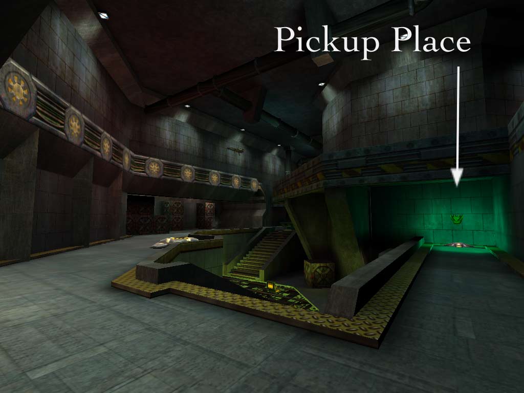
One thing that is often respected by game players all over, is signaling where the pick up items are. This is more up to your own personal design choice, but having something indicating where pickups are makes learning the map a little easier. An example of a pickup place is shown below, the item in the green light is body armor, floating above a pad. You can even go as far as to put armor in green lighting and weapons in red. Players who see this catch onto maps a lot faster, plus these little nuances can add a nice little touch to your area that may be lacking a little spice.


THE TOTAL PACKAGE
(MP AND SP)
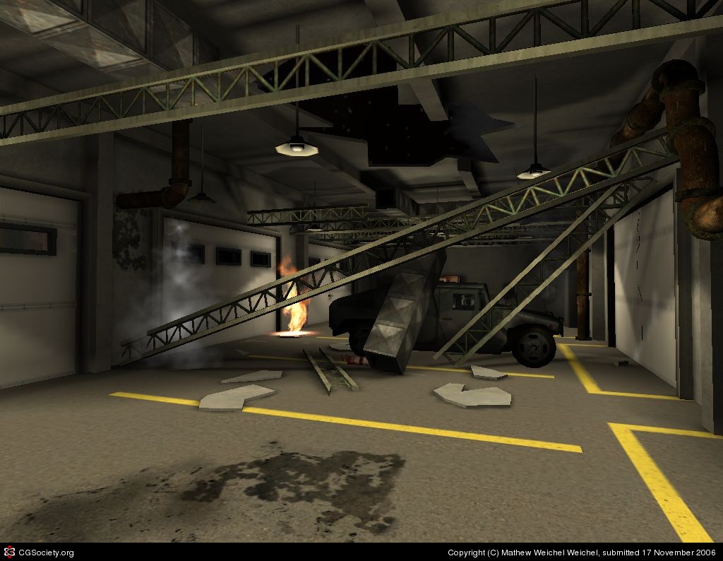
Now that you’ve got some idea on what adds flavor to an area, it’s important to bring the whole thing together. This means paying attention to everything in your map. If you have a wild ceiling, doors, walls, lighting, but don’t do any detail work to the ground, you are cutting youself and your players short of a perfectly rounded map. Sometimes designers (and i’ve been guilty) get too carried away with detailing out a section of a room, and then run out of (rendering) budget to finish a wall or floor. Know your limitations before going wild with the design. Every view of your map should be filled with a lot of things going on, like no matter what you are looking at, it’s worth taking a picture of. For example, in the picture below, I will show you how i detailed this room to capture this elaborate scene that took me only about a day to build:

Floor:
2 Different dirt stains
Rubble
Painted sections dividing the floor
Fire
Hummer
Pipes

Walls:
Pipes
Stains
Garage doors
Tons of trim
Normal and broken rafters/beams
Some lighting effects
Steam

Ceiling:
Hole in roof/sky showing (great for lighting btw)
Ventilation shaft
Hanging lights
Pipes
Rafters/Beams
Trim
Lesson 4: Aesthetics Part 1

(Both SP and MP)

In this lesson, I will explain some of the things that designers will do (or will not do) to please the eye of the player. Some of this will seem so simple, and just downright common sense, but as every designer will find out, every detail counts.

THE TOILET BOWL EFFECT

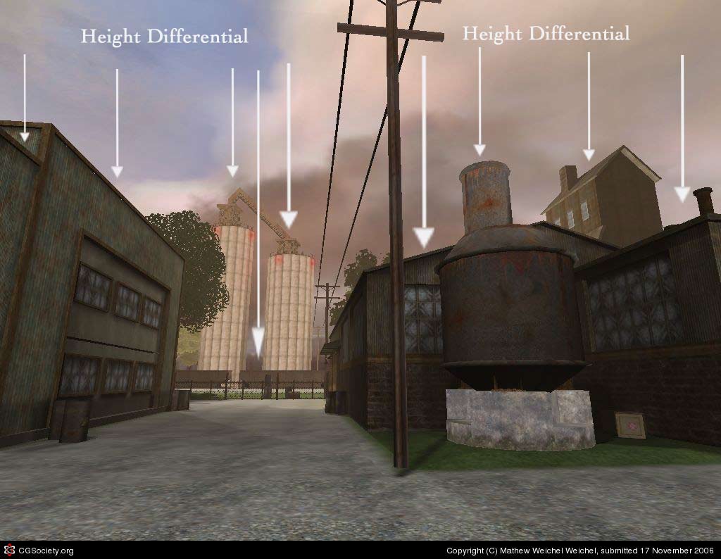
The toilet bowl effect pertains mostly to outdoor areas, where the retaining walls of the map are at an even height--thus making you feel like you are in a giant cylinder, or toilet bowl if you will. Unless you are in the middle of a giant missile silo, there shouldn’t be any excuse for having the same scaled wall encompassing even a small amount of your area. Break it up! Even a guy from Nebraska, who is used to looking at everything at one height, can envision craggy terrain, small buildings, power lines, pipes, monuments, trees, cranes, highways, the list goes on and on of what you can do to build fake surroundings that close in the map while breaking up the horizon where sky meets the level. In the example below, I have shown you an example of some simple ways to break up the height of a level's surroundings, rather than a wall of equal height encompassing the level, like a toilet bowl.


THE MAN IN THE BOX

This is much like the Toilet Bowl effect, except it relates primarily to interior areas of your map. One of the worst things you can do, is build your map full of box shaped rooms. Box shaped rooms are easy to build, but creates minimal fun and originality. One box shaped room in a map probably won’t harm a level (it’s almost unavoidable sometimes in a modern setting), but if it’s avoidable, drop it from your map. Every room in a level should bob, weave, and twist with Over and Under elements whenever possible. It’s not asking for much, even rooms shaped somewhat like a H are more intriguing.

TRIM TRIM TRIM

I CANNOT EXPRESS ENOUGH THE IMPORTANCE OF TRIM!! Trim is so vital to the appeal of everything you see. Even if you are copying a real-world room without trim, trim the hell out of it. Trim is by far, the single most important thing in a room, next to a door and walls. Trim is a very easy way to make a boorish room come alive. It adds depth and shadows, adds character and perhaps a complimenting color an area is lacking. Heck, you might even trim out your trim in some instances! Sometimes you don't even need to explain what kind of trim it is, just make sure it is there! It doesn't matter if it is thin or think, concrete or track lighting, trim from ceiling to floor. In my opinion, it should be over half of your brush work.

CLOWN VOMIT

Also called, theme, or the lack thereof. A map should have a consistent feel about it. This is accomplished by carefully picking out a texture set that compliment eachother. My suggestion to you is building the room in your level that has the most detail first so you can get it looking the way you like it. The textures (art) you use should be the primary palatte for the rest of the level, giving it some universal look. Nothing makes a map look more gross than a map with three different texture themes throughout the map. For example, don’t make a orange and gray metal laden room link into a green and yellow stone room. A consistent look is key. Not that you can’t change up areas of your map, just be careful to keep some of the same colors that you’ve picked throughout it all.